Tired of not getting any conversions from your landing page?
That’s because a drag and drop landing page builder does not show you the critical components to creating a landing page that has an extremely high conversion rate, and as a result of having a high conversion rate you are going to make more money per month from your marketing efforts.
A lot of people actually miss the point of what landing pages are supposed to do, especially when using a landing page builder with pre-made templates. The entire point of a landing page is really simple.
It helps to solve a problem.
If you can make your visitors believe that you can solve their problem, then you will win the click and add more leads and sales through your landing page & marketing.
If you want to live the lifestyle you’ve always wanted, you need this part of the puzzle to fit. You need to add this cog to work effectively.
This is the engine of your machine… and you are responsible for getting it on track.
So today, I’m going to show you how a real, functional, effective landing page is constructed in order to get click from your ads and add leads… the right headline formula, the right web-copy, call to actions, the biggest landing page mistake you need to avoid, and more.
What is a Landing Page and How Does It Work?
A landing page is a single-button page on your website that is crafted to generate one specific response from visitors. It is, quite simply, a web page specifically designed as the ‘landing place’ for new web visitors, and is designed to elicit a reaction (usually in the form of a call-to-action button push) from visitors who click on your ads to view your website.
The purpose of a landing page is simple. It is designed to convert a click/visitor into either a lead or a sale.
A landing page is different from your other web pages because every element of this page is designed to generate one of two goals for you.
- Collect information (i.e. email addresses) from your site visitors and convert them into leads
- Convert your visitors into paying customers
Your landing page is THE PRIMARY TOOL in your online business responsible for cash inflow.
How to Create Landing Pages That Convert
If you need an absolutely fire landing page that will generate a buttload of money, then there is ONE thing that you have to do right…
You need to produce HELLA good content!
If you have no idea how to create killer content that converts, then you have come to the right place… because this is something that I can actually show you.
You Are About To Learn…
- how to create a landing page that converts over 45% of cold traffic to leads
- how to create high-dollar content your audience will LOVE and SHARE
- and how to turn that landing page into a money-making funnel
You see, most people make the mistake of designing their landing page without double-checking their methods and techniques.
And because of this, they often do not optimize their landing page for maximum conversions!
I’m gonna tell you straight out… an effective landing page will require not just a brilliant design and the perfect approach, but it is also going to need some killer website copy.
So if you are new to the game, don’t despair quite yet! I would recommend that you check out a book called “How to Write a Good Advertisement” by Victor Schwab.
It is a little old-school, all the best copywriting books are, since it was written in the 1940s… but it is packed with knowledge that transfers 100% to our world today, mostly because the principles are founded in the psychology behind sales and headlines.
Before you build your page, you need to understand what makes a successful landing page work. Successful landing pages use 4 core zones that work together to maximize conversions.
You have to know how to design your page to make full use of these 4 zones. You also have to know what words to use to really bring everything together for potential customers.
An effective landing page follows a certain format to convert successfully. Check this out...
The question, of course, is this…
How do you create a high-converting landing page? How do you make your content pop and compel customers to click-through and buy?
As I stated earlier, there are 4 important zones in every landing page that you must get right if you would like it to convert. So let’s talk about them.
#1… Create The Headline
You have 6-seconds to capture your visitors attention.
When visitors aren’t hooked immediately by the headline, can you really expect them to read the first sentence of your page, much less all of the sections that follow?
Absolutely not. At that point, they will just click away and leave your page. Why shouldn’t they? Their time is their most important asset.
Your headline is the promise that you can solve their problem. And it must convey this message effectively.
With that being said, here are 4 examples of headline styles to dial in this first landing page element.
Revealing a Secret
People love secrets.
Secrets make people curious. People love knowing that they know more than someone else, and secrets promise this.
You can (and should) use this natural human tendency of humans when creating a landing page.
For example, you can say something like:
Free Course/ Video/ eBook Reveals the Secret to _______________.
What does your offer intend to reveal? Put it right in your headline. Draw people in with curiosity. Model a headline from your swipe file and hook them in with the promise of hidden, secret, forbidden, or elite knowledge!
When you do this correctly… Boom!
They will opt in, sign up for your offer, and give your product a try. When your optin or product delivers, you begin to earn their trust.
This gives you the opportunity to increase customer lifetime value with that customer by increasing the odds that they will trust you on future offers!
You will quickly learn that people often take action based on their emotions instead of logic, and you need to take advantage of this tendency to make your landing page work.
Problem - Solving
Remember how I started this post with a question that seemed to scratch your itch a bit?
“Tired of not getting any conversions from your landing page?”
In your head, you were probably thinking “hell yeah I’m tired of that!”
And that question made you need to read further. You wanted to know if I could actually help you to solve your problem!
Well, your audience is a lot like you! They need someone to scratch their itch and make them think… “Man, this guy is reading my mind!”
In this headline style, you start out by clearly stating the problem that they’ve been experiencing. Then, you quickly follow this up by presenting them with a solution.
The basic idea is to say it like this.
Tired of (insert their biggest problem here)? Well, I’ve got a (insert your offer here) that will teach you how to (the solution to their problem).
I have a landing page headline that goes:
“Are you struggling with driving traffic using Facebook ads? My FREE case study will show the EXACT ad I use to generate 14,000 leads online!”
See what I mean?
When you state the problem in your content, you give your audience the chance to identify with it. If they are not having that problem, obviously they are not your target customer.
But if they are your target customer, you must position yourself as THE BEST PERSON to help them solve their problem. And you must position your offer as THE BEST SOLUTION to help them do it!
Get Specific Results in Your Headline
People don’t just want results. They are after specific results. They don’t just want to know that they can lose weight, clear up their skin, or build muscle. They would like to know how long the results are going to take.
In short, people love specifics. They love hard numbers, and they need to believe that their target is within easy reach.
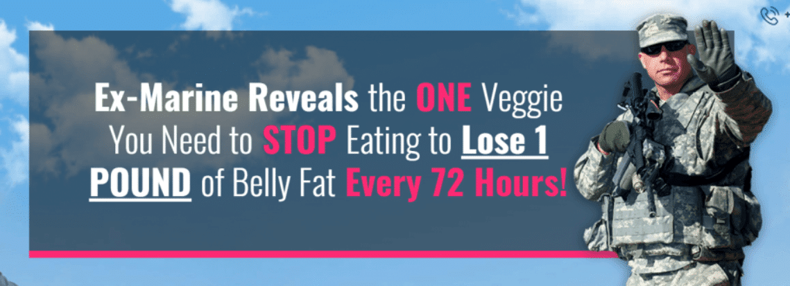
So don’t just tell them that your product will help them to lose twenty pounds. Instead, tell them that your product will help them to lose 1 POUND of Belly Fat Every 72 Hours!
Like this landing page example
Of course, you need to be ethical and realistic. So maintain your reputation while also delivering specific numbers. This is part of the magic that creates a winning landing page!
Specific Result Without Giving Something Up
Another ‘specific results’ framework that you can use involves pitching a headline that contains the promise of a specific result that doesn’t require you to give something up.
This framework is kind of like the “specific result” style, but with a different twist. In this approach, you actually use the incentive of showing your customers how they can ‘achieve their goal while avoiding sacrificing something they love’ to bolster the value of your product.
How would you like to lose weight without giving up pizza?
What if you could stay fit without giving up potato chips?
I think all of us can identify with dreams like these! We want awesome results, but the deal is even sweeter if we can avoid giving up something we love!
The idea behind this is that it makes their problem seem easier to solve. This is very important, because people are naturally drawn to the easiest possible way to get what they want!
#2… Landing Page Design and Imagery
Your landing page needs dynamic, relevant imagery to grab visitor attention. This is the second super-important zone to get right!
The imagery may not technically be quite as important as the wording or the headline, but it certainly adds to the effect. It is a crucial part of the process of increasing visitor conversion.
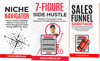
One great idea for images is to use images of your products. The cover of your book or DVD are awesome ideas to start with. A professional head-shot of you, the person offering the product, is also a great way to drive everything home.
Just get a professional image up there! Your visitors are visual people, and it will feel weird to them if there are no images to look at.
As far as specifics go, there are three vital elements to consider when choosing an image:
The Image Itself
You want your image to be simple, but catchy. You want it to draw attention to your landing page without distracting from it. If you are promoting an eBook, then include the book cover.
If you are the face of your product (which is usually the case with services like coaching or consultation), then put a professional headshot of yourself on the site.
A key word here is professional. A bad image will distract your visitors and take away from the page, so make sure that your image compliments the purpose of your landing page without taking away from it.
Landing Page Color Theme
Don’t go too crazy with colors. You generally want a color scheme that is simple and toned down. Look for the colors that really resonate with your brand… colors that you feel good about.
I tend to use more whites, blues, and natural colors on my landing pages. You don’t want your page to be distracting. You want to focus on the purpose, the offer, and on the customer taking action!
Not the colors!
Design
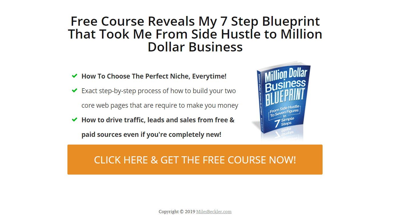
As with colors, stick to a simple landing page design. Take a look at my page.
At this point in my career, I have learned to keep things simple. I stay away from needless flashiness or rediculous images/fonts/colors.
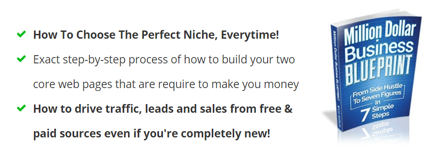
It is a simple white-on-black design, with a plain white background. For an image, I use a book cover. There is an orange call-to-action button at the bottom, which is the color that I use for the buttons on all of my pages.
The best optin pages use a simple approach!
#3… Copy - Quotes, Bullet Points, Testimonials, Etc.
The website copy… aka, the ‘written wording on the page,’ is the third vital zone to get right if you want a winning landing page.
On my previous landing page, I used a quote and a quick 2-sentence blurb as the main content to describe my offer. But I changed this up after a while. I turned the blurb into bullet points, just to see which one would end up working better.
Through split testing the data, I have seen that bullet points work better on my site, with my audience.
Note: You are never one funnel away from real success, Testing is the critical ingredient, and we will get to that in just a minute!
Basically, the body of your landing page should consist of the answers to the question “what’s in it for me?”
Your visitors are going to want to know exactly why they should bother sticking around… so get to the point as quickly as possible.
You want to be concise, but you also have to know when to elaborate on the information you just unloaded in the headline.
A 2-sentence blurb or bullet points could both work, so you don’t have to get hung up on one or the other. The main thing to keep in mind is that you need to support your claims, and show your audience what is in it for them.
As long as you do these things and supply a compelling offer, you will start converting with a much higher success rate!
Whether you use bullet points or go for the 2-liner blurb, just be sure to support your claims and to reassure your customers that it’s really all about them.
Focus on them and what they can get from your offer.
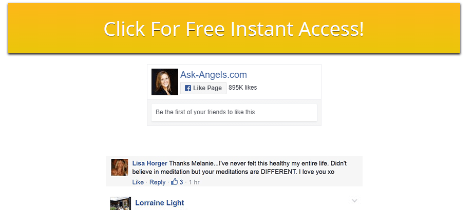
Don’t Forget to Put Testimonials in Your Landing Page
How do you demonstrate that you’re for real? How do you show them that you are legitimate, and that your product is worth their hard-earned money?
Easy. Give them proof! Create a landing page with testimonials!
I tend to put the testimonials part right down below the call-to-action button. This still allows your headline, bullets, imagery, and button to live above the fold, so your customers will still be able to see them right away.
Your first step is to hook your audience. But then, keep in mind you have to sell them… and testimonials can help with this step!
One awesome formula that I have found for testimonials is to do this.
Make sure to place your testimonials below your headline, bullet points, imagery, and offer button. Then, repeat your headline, bullets, imagery, and offer button again down below the testimonials.
This allows your visitors to scroll down easily without making them feel lost in the up-and-down motion of viewing your page.
Need some testimonials to get the ball rolling? Consider letting a dozen of your friends try your product for free, and then ask them to write honest customer reviews about it!
#4… The Call to Action (CTA) Button
This is the fourth important zone of your landing page.
Do not EVER forget this crucial part of your conversion system! It may not be quite as important as the offer itself, the headline, or the bullet points, but it is one of the most misunderstood elements of any landing page! And yet, it must be correct if you want to maximize conversions.
The CTA button is basically the button that visitors click so they can get their free gift, to opt-in to your deal, to buy, etc.
It is very important to keep your CTA buttons the same color.
You don’t want your customers getting confused and thinking they are on a different site when a new page or popup loads.
It might seem like a small detail, but it is a vital element to get right if you want to maximize sales and/or leads through your landing page with any consistency!
Consistency is the key word here!
I used to lose sales on my page by using a different color on one of my upsell buttons. Once I realized what was happening, I switched the color back… and that fixed the issue.
The Biggest Landing Page Mistake You Must Avoid
I mentioned earlier that I did a test on my landing page. Well, as it turns out, building your landing page is really only the first phase of the process. A lot of website owners actually skip this second part… and miss out on huge numbers of sales because of it!
Do not EVER assume that your first idea is going to be the best possible idea for your landing page.
The real progress starts to happen when you start testing your landing page.
If we break up your landing page into 5 of the most fundamental elements, it would look like this.
- Offer
- Headline
- Bullet Points/Copy
- Imagery
- Testimonials
This is also the order that you want to test your elements in.
This is called a ‘split test.’ It is very important that you set up your landing pages and leave it alone during a split test. DO NOT tweak things on a daily basis while testing! You need concrete numbers to show you what is working and what is not!
First, Create the most dynamic landing page you have the ability to create.
Then, after giving it some time and logging in some numbers, move on to step 2 and start experimenting with it by changing only one element.
Split testing is a blend of creative artistry and spreadsheet formula… mixed together to create fantastic results. I have many posts on how to split test the right way.
My post “number 1 mistake people make with split tests” is a good place to start but…
I would rather see you write the best copy and landing page design you can today, throw it up on your website, send traffic to it for 7-14 days, and then come back to learn more after that.
Why?
Because many people make the mistake of only reading and researching, without ever launching a page of their own!
I want to see you succeed, and the best way to succeed is to get started, so get your new page live!
Here’s a checklist to help you create landing pages today.
Landing Page Checklist
This checklist has always enabled me to maximize my results while also helping me to remember everything that needs to be included. Consider it a free gift to help you get started on the right foot!
Do this 2x the first time, you need to split test an offer first. Dial in what people actually want!
___ 1. Write Two Headlines. Keep them short, sweet, concise
___ 2. Write the body or bullet points
___ 3. Include imagery (headshot, book cover, etc.)
___ 4. Create a call to action button
___ 5. Be sure that your first headline, initial copy, and button is all above the fold (the bottom of the screen, they do not have to scroll down to see your button)
___ 6. Add testimonials after the button
___ 7. Repeat your headline, bullets, imagery, and CTA button after your testimonials
___ 8. Take it live and start collecting data
___9. Keep your landing pages distraction free, clean, neat, and professional. Less is more!
Use this checklist each time you create your landing pages! Do you want a truly #baller page with awesome conversion rates? This formula will help you get there!
In this free guide I show you the best sales funnel system to create landing pages you can split test (A/B testing).
A/B testing will become pivotal in increasing your conversion rates as you move forward in your business...
If you haven't started A/B testing yet, you should and I'll show you how here.
What Information Should You Collect From Your Subscribers?
This is a commonly asked question. When getting your audience to 'opt-in' for your free thing, should you ask for a 'name' & 'email'? 'name', 'email' and add a 'phone number'?... What converts the best?
It really depends on what you are looking for.
Most commonly, the less information you require from your audience, the higher your conversion rate will be. Hence why most marketers tend to just ask for an 'email address' and don't ask for a 'name'.
However, this can sometimes lead to a lower rate of quality leads. But that's normal when you lower the gate of entrance.
The more information you ask for, for instance 'name', 'email' and 'phone number', the lower your conversion rate but the higher the quality of leads.
A happy middle ground could be requiring your audience to add their 'name' and 'email'. That's a good balance, and you can still maintain a high conversion rate.
However if you are looking to maximise your conversion rate, leave out 'name' and just start using 'email'.
If your content is really and truly valuable, the right people will happily give you their name and email address so long as the value is there for them.
Whether you add name & phone to your webform doesn't really matter, the most important thing is that you get going, and get people to click your ads and add themselves to your email list.
Important Note - Make Sure You Add Google Analytics To Your Website
It is important to remember and something a lot of marketers forget is making sure to add any relevant Google Analytics tracking code your landing page and website.
Adding Google Analytics is going to allow you to track exactly where your traffic is coming from, what pages your audience click on the most so you can create more efficient marketing. This allows you focus in on the traffic that is bringing you in the most email leads, and eliminate the ones that are not working.
So go ahead and start using Google Analytics on your new page and start producing better marketing results, saving more time, knowing what traffic source is bringing the most email leads and fully understanding what content get's audience to click.
Conclusion
There is now no need to ask Google, "what is landing page?" And spend weeks trying to find our the secrets to a landing page that gets the click and converts...
... Because you now have everything you need to go out and create yourself incredibly high converting landing pages.
It doesn't matter what one landing page builder you end up using so long as you make sure to follow the guidelines in this post, if you are looking to add new leads and and making more money from your marketing efforts.
I hope this post will also help prove to you that landing pages don't have to be complicated, and that often times the simpler and less complicated landing pages will often add far more of your target audience in to your email list, therefore allowing you to provide more value to them and make more offers.
And when you provide more value for your list and make more valuable & new offers to them you will begin making more money per month than you maybe thought was possible...
If you add enough value to your audience, you will start to click on your offers and click the "sign up now" buttons on your landing pages, but only if you add insane amounts of value into their lives.
But it all starts with your landing pages, and if you take everything you've learned from this one post and start using it with your new landing page builder, you're going to be on to a winner.
If you have any questions about landing pages, landing page builder or anything marketing related, just let me know.

